PiggyAlpha Logo and Brand Design
Client: PiggyAlpha
Tools: Photoshop, Illustrator

PiggyAlpha, a Fin-Tech platform that aims to improve the financial responsibility, wellbeing and habits of their clients using proven financial principles contacted me. The goal was to design a logo and brand identity.
The brief provided emphasized that they wanted a brand identity stood out in the current fin-tech space, they also wanted a logo that was optimized for viewing on digital devices of all sizes. The choices on the brand colour and identity were left up to my discretion with feedback provided by the clients through the process.
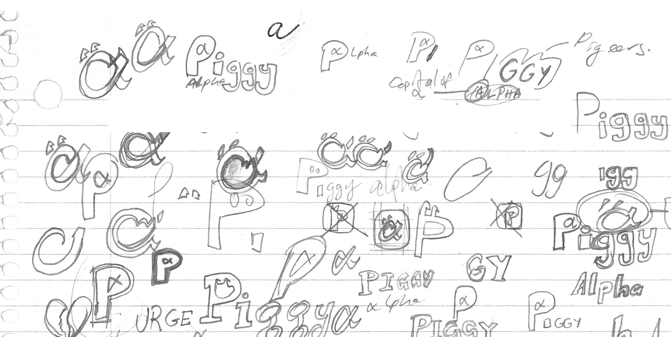
I like to get ideas out so I created the initial sketches to know the direction the clients wanted. I initially went for a more playful direction using the alpha symbol as the main focus to contrast with the other fin-tech brands. I made some digital mockups on Photoshop to explore typefaces and fonts.
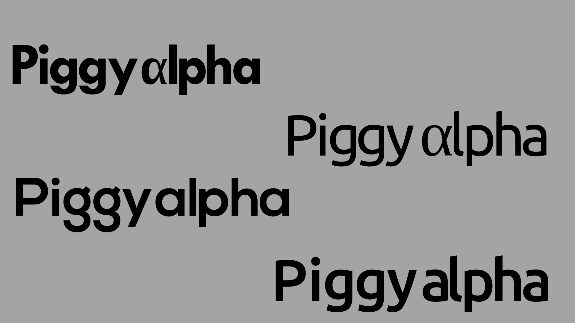

The client wanted a subtle and refined direction, so I began to focus more on using typeface to create the desired atmosphere.
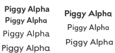
I picked a list of typefaces that displayed well at different screen sizes and devices. I wanted to communicate the company’s ethos of using proven financial principles. I chose a sans serif typeface that was direct and showed rigor due to use of primary shapes. After deliberation, we decided upon the narrow version of the Bill Corporate font.


I chose the colour of green initially for the identity, due to the financial association, but this was agreed to be obvious and I revised it to purple, purple historically being a colour suggesting prestige and value due to its scarcity when colours were made from objects in nature.

A logo mark was still needed and so I tried to use more abstract shapes to communicate the goals of the company.

The colour was then refined to align with the prior direction of subtlety and displaying bold restraint.

Afterwards, I applied the colours we chose to it as well.

A final Logomark was then made.

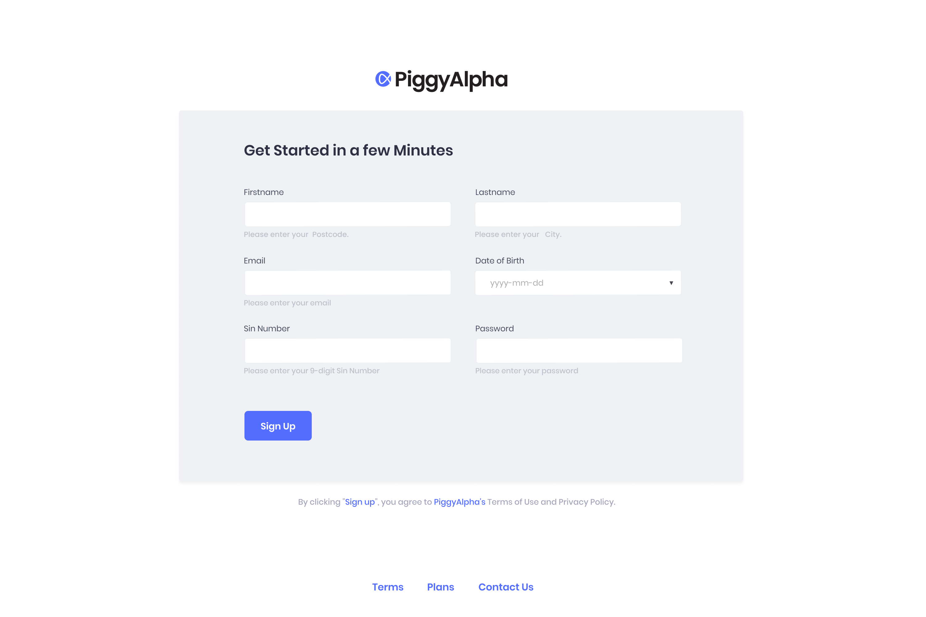
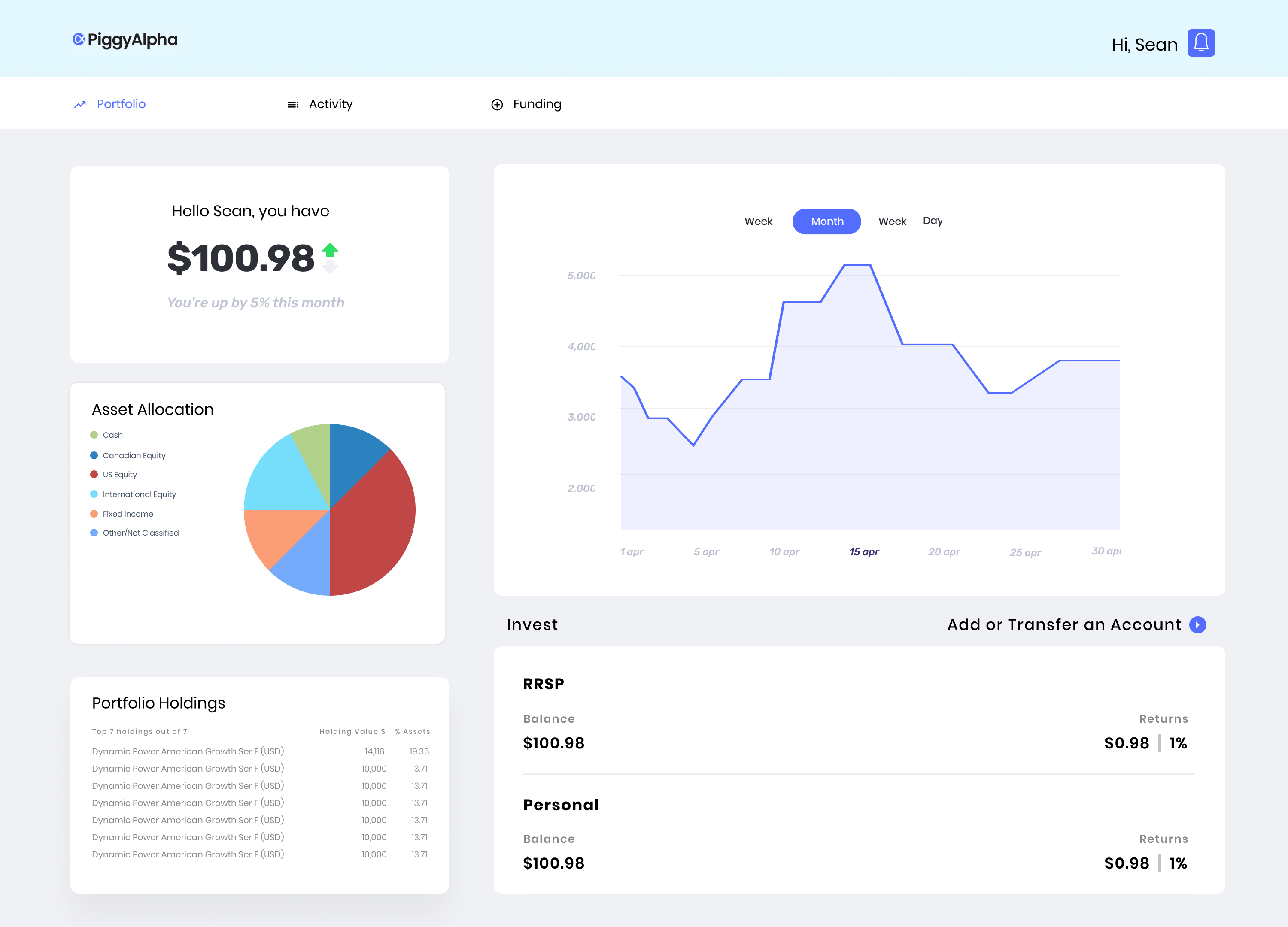
The combined Logomark and Logotype was decided upon and submitted to them and tested by their design team in their environment.